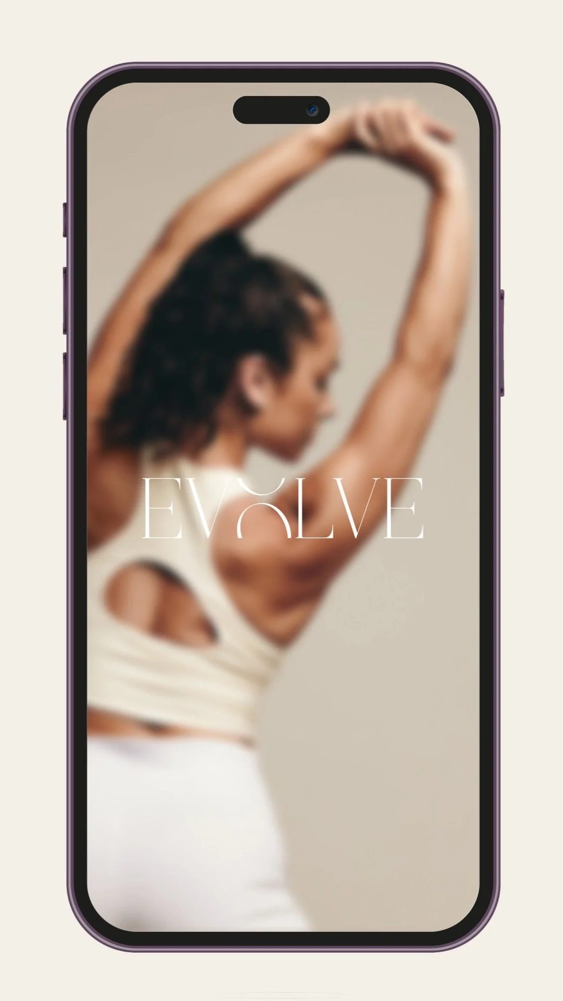
EVOLVE Fitness Studio
OVERVIEW
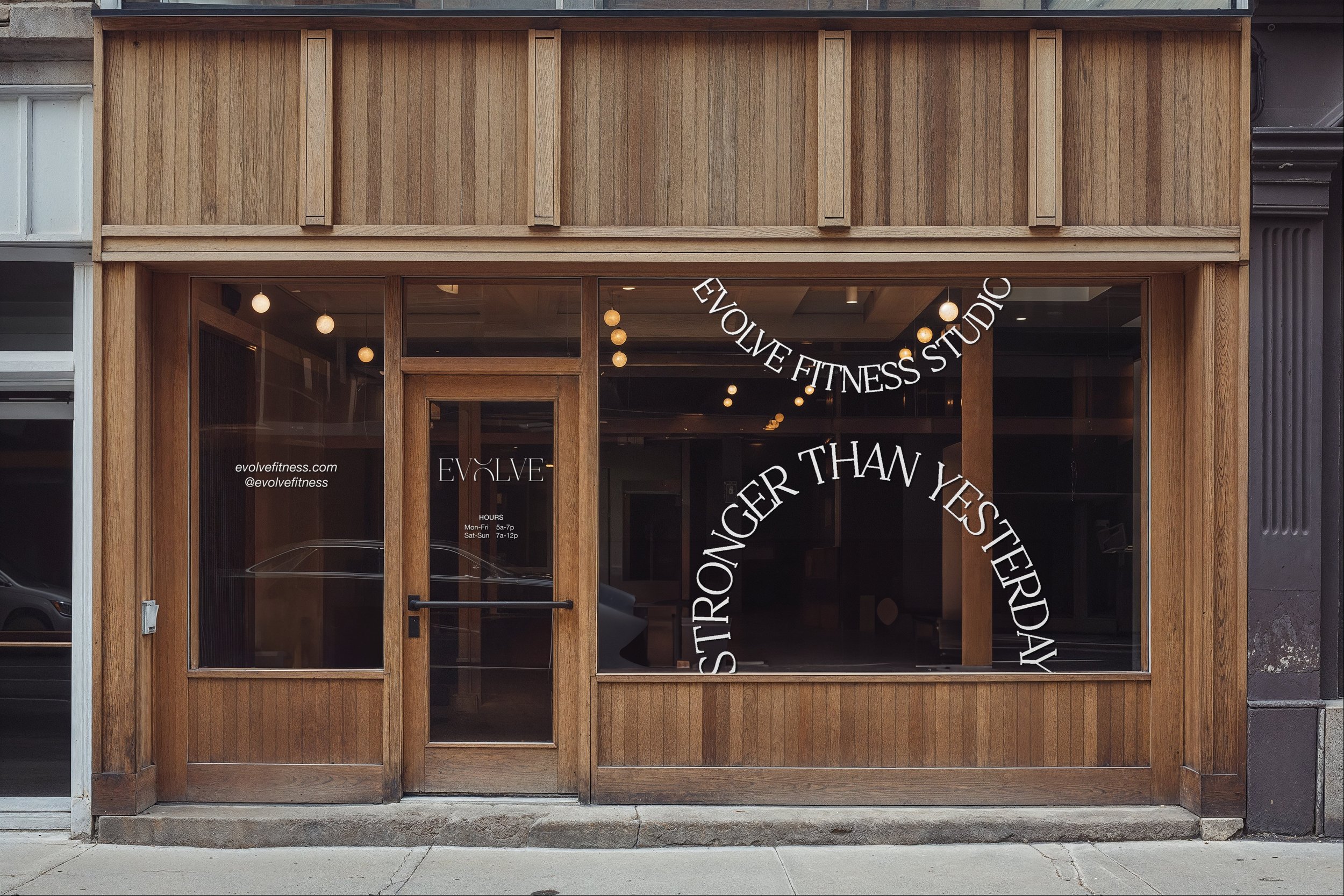
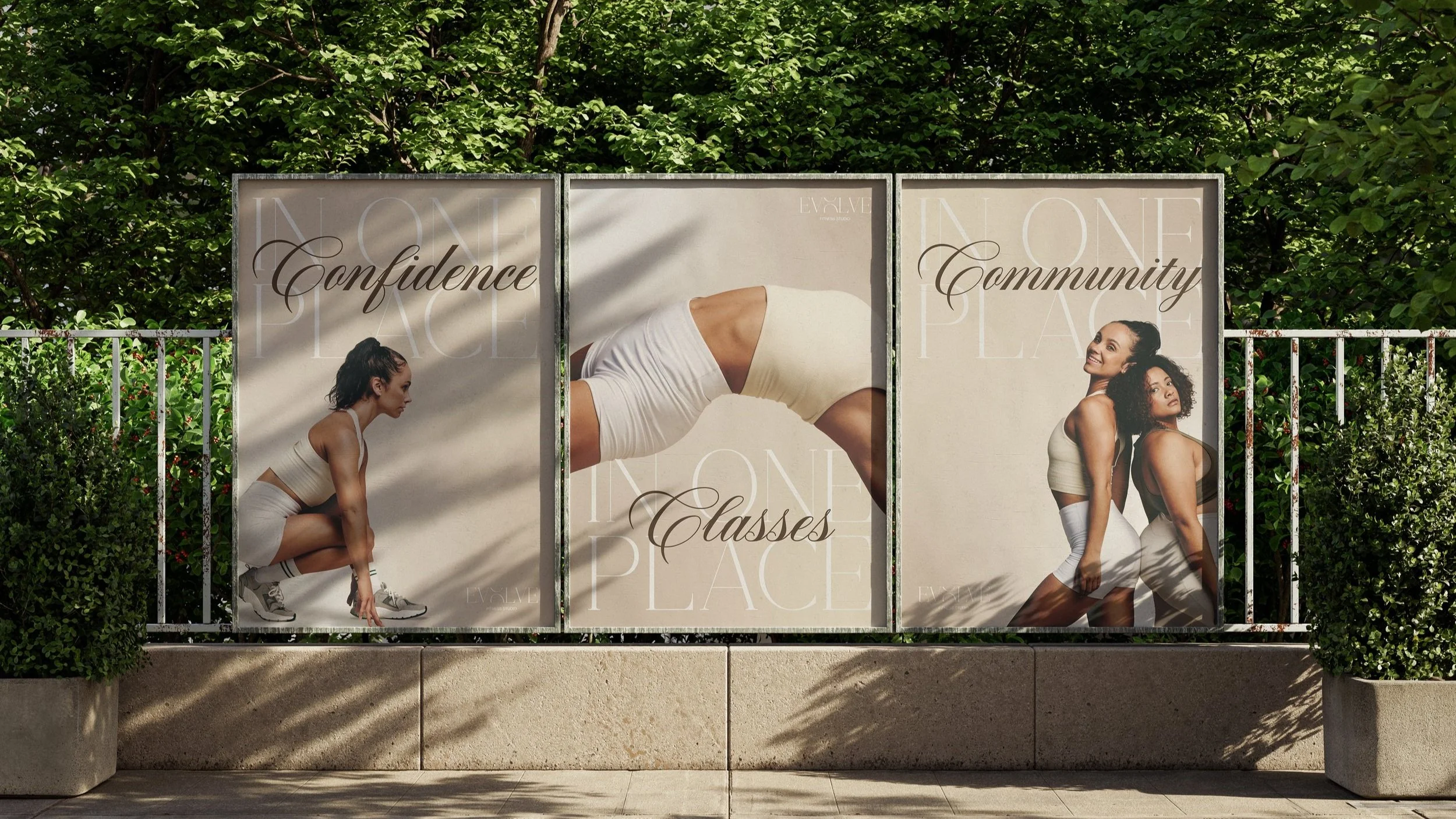
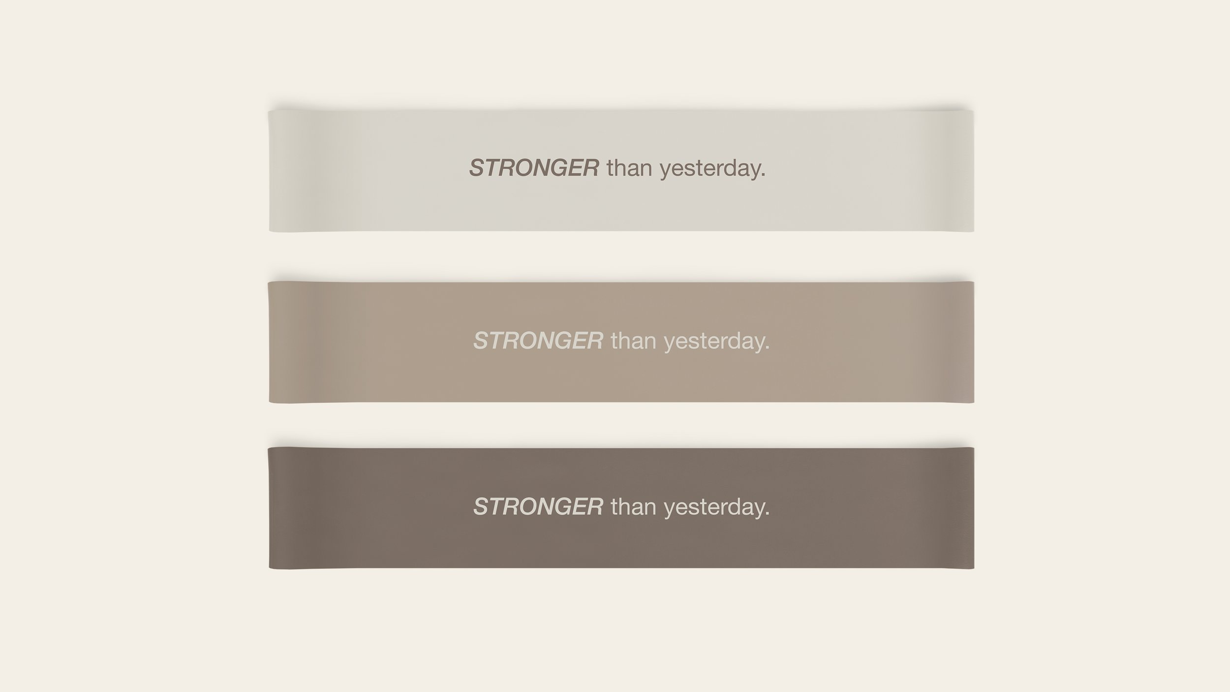
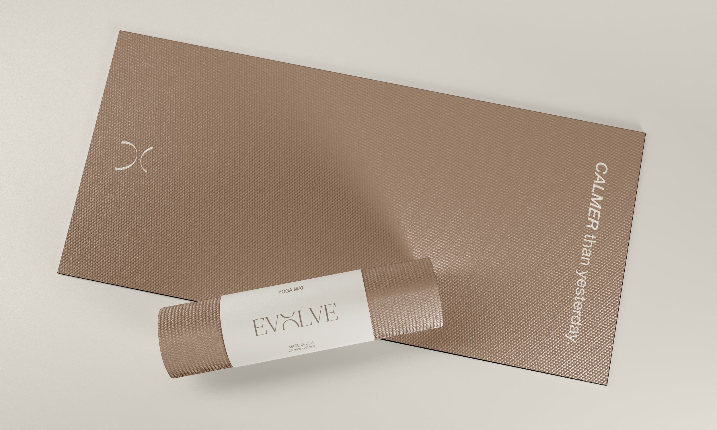
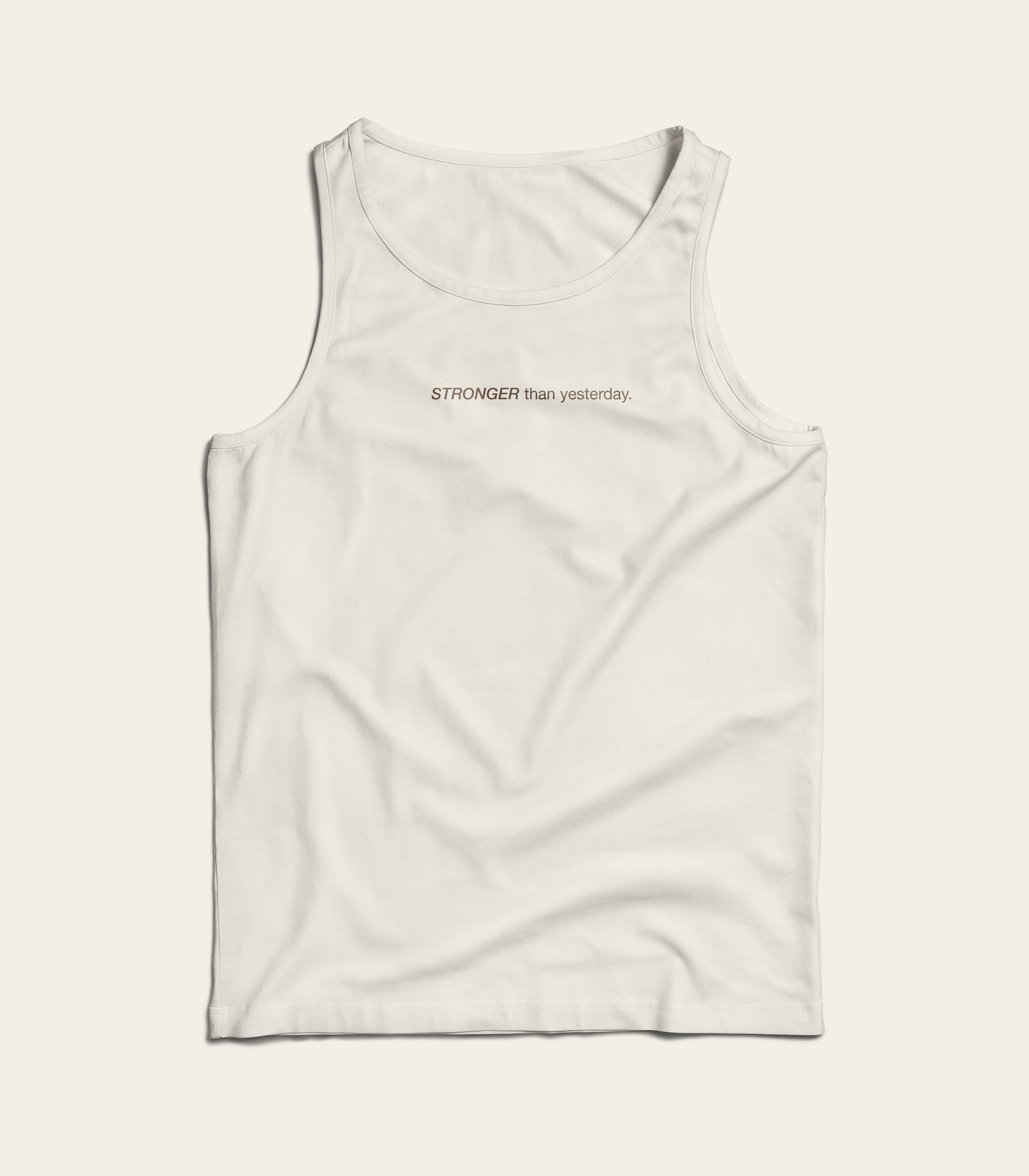
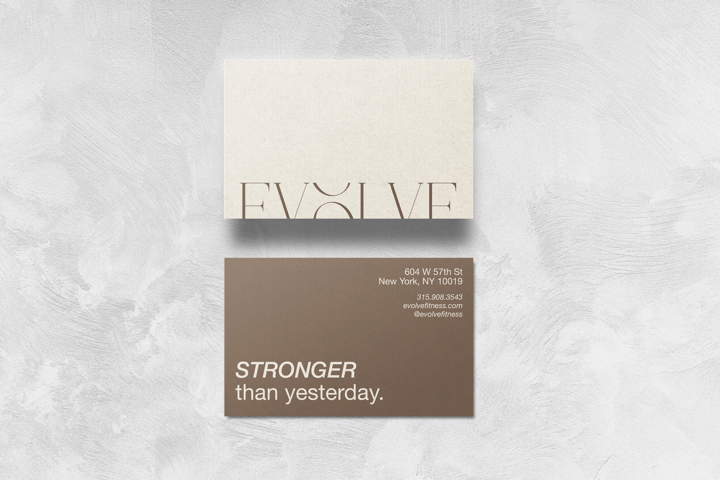
For my capstone project, I chose to design an all-in-one fitness studio that offers a variety of classes at one price. This solves one’s problem of having to choose a niche in the fitness world or not being able to afford multiple memberships. I chose the name “EVOLVE” because unlike other chapters in our lives, a fitness journey is one that will never be complete. You’re always focusing on progress over perfection, it’s a constant growth. The tagline, “stronger than yesterday,” originated from the idea of showing up and performing better than the day prior, even if it’s by 1%.
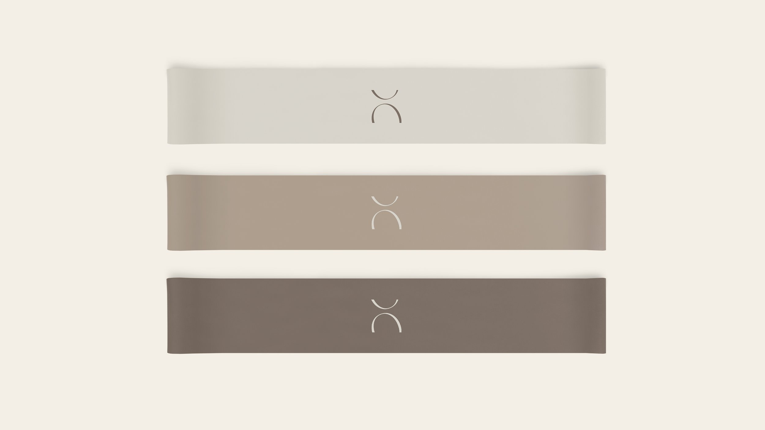
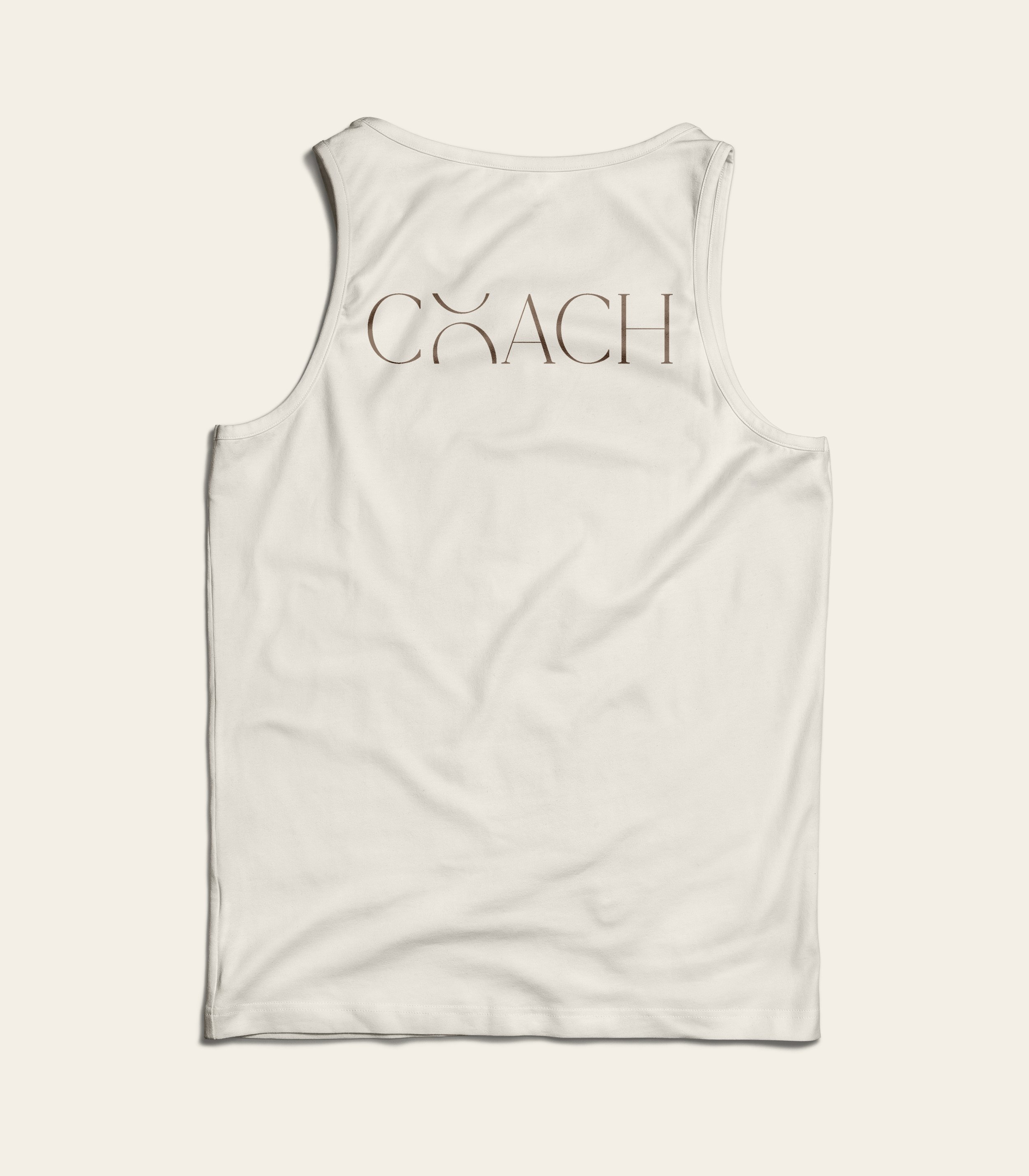
The logo and branding utilizes an elegant, serif typeface, Shefian. The logo is unique because the O is captured in a shifting motion to represent growth and movement and once it’s extracted as the symbol, it also resembles a body. The chosen type, color palette, and imagery create a minimalist, elegant feel.
ROLE
Designer, illustrator
TOOLS
Adobe Illustrator, Adobe Photoshop, Figma

Grayscale Logo


Color Logo


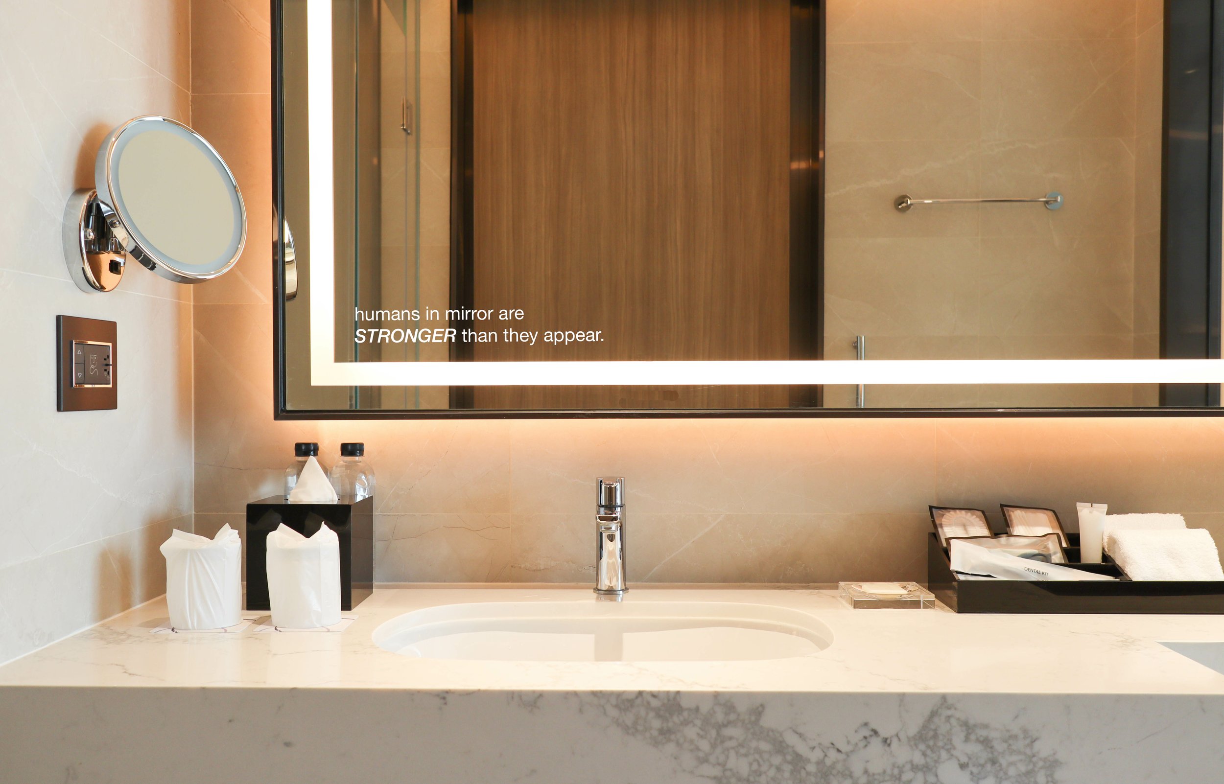

STRONGER THAN YESTERDAY
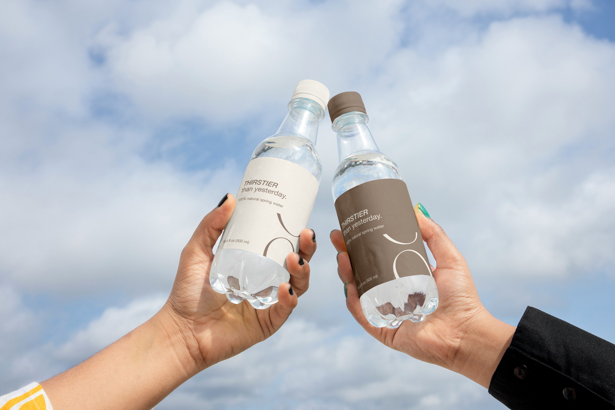
As I was expanding the branding, I began to swap ‘stronger’ out for other comparative adjectives in fitness. For example, runners or cyclists can be “faster than yesterday;” yogis can be “calmer than yesterday;” if you find yourself working extra hard, you might be “thirstier than yesterday” or “sweatier than yesterday.” This is a unique way to encourage clients to think about all of the different ways that they can demonstrate growth if they’re ever discouraged.


PROCESS
My biggest challenge throughout the duration of my capstone project was narrowing in on what it was that I wanted to communicate through my designs. I had so much inspiration sourced from Pinterest that I started to lose the main idea of EVOLVE. I started out so focused on making this a place for people to start their fitness journey that I forgot my main marketing proposition of everything being in one place.
There were many hours that I’d spend staring at my computer and scrapping everything I’d designed because even I was confused on which direction it was supposed to be going. After much frustration, I ended up writing my simple big idea on a piece of paper and thinking of ways that I could expand the system from there, after that the pieces started to fall into place and I was able to generate more ideas as I continued working.


DIGITAL PRESENCE
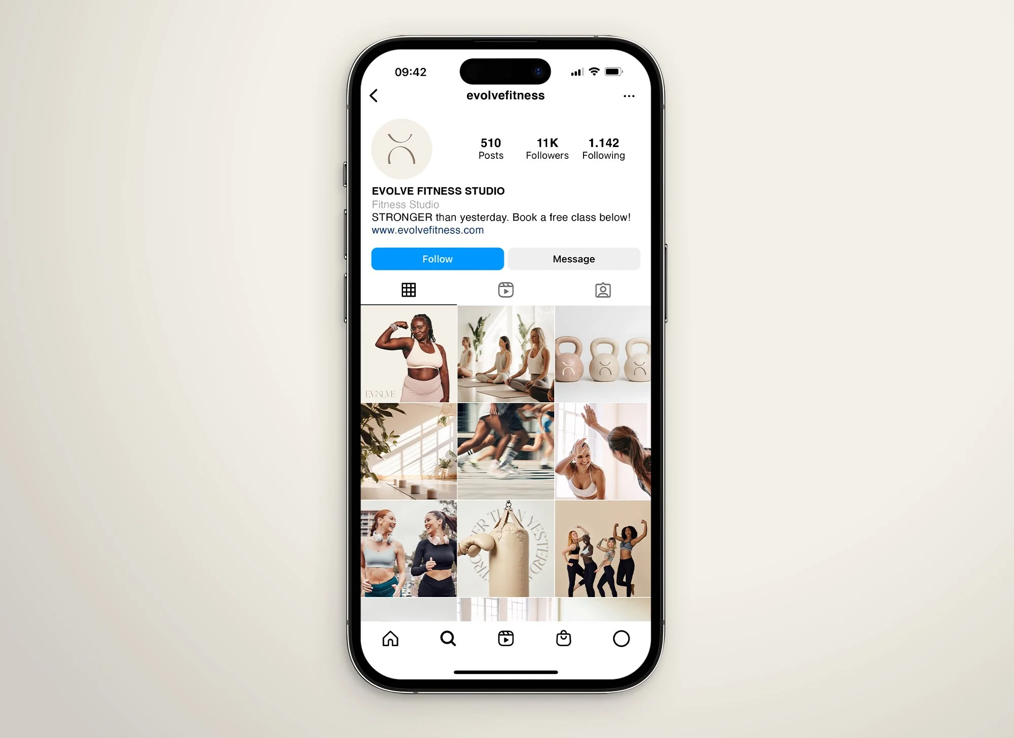
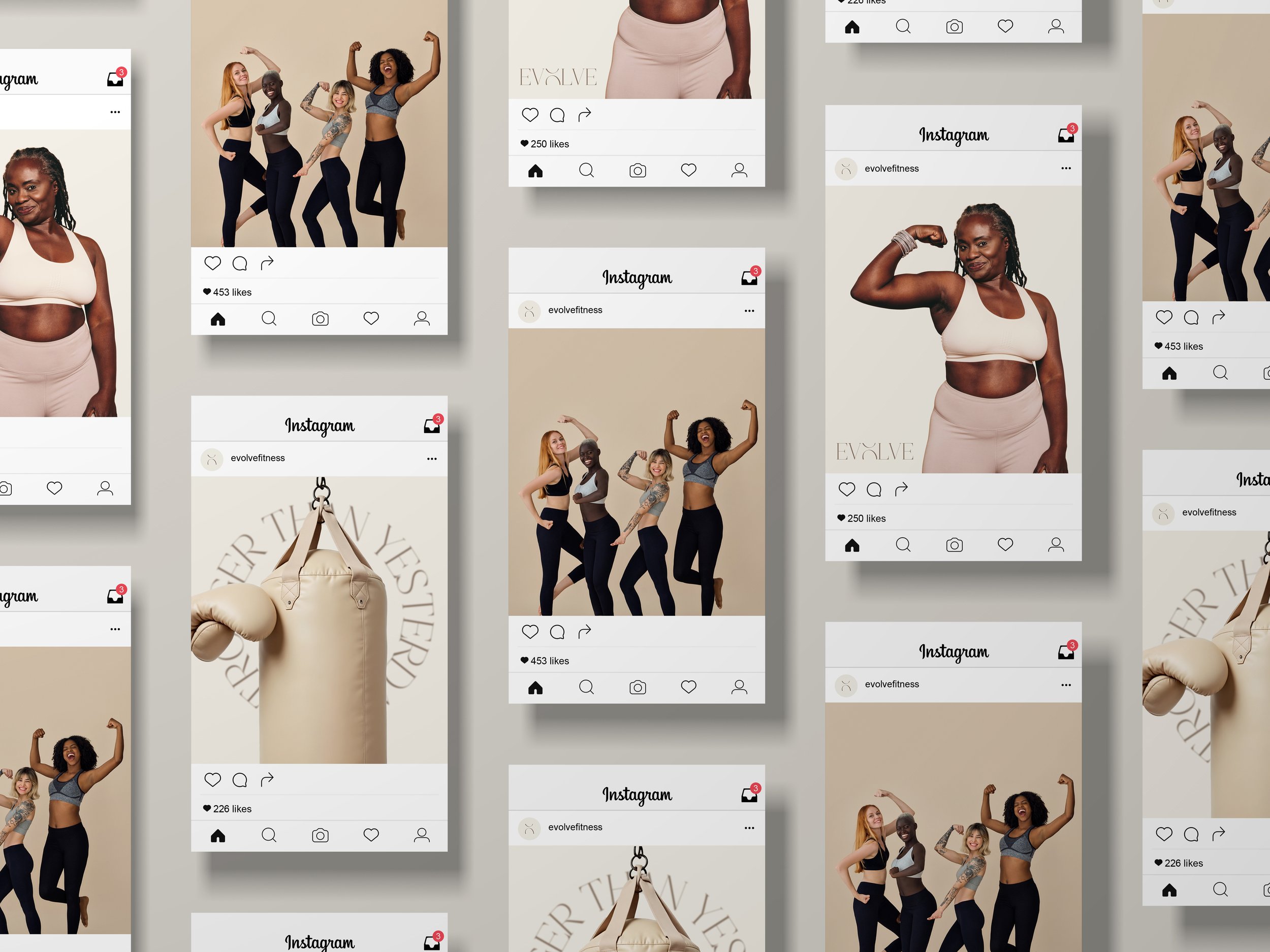
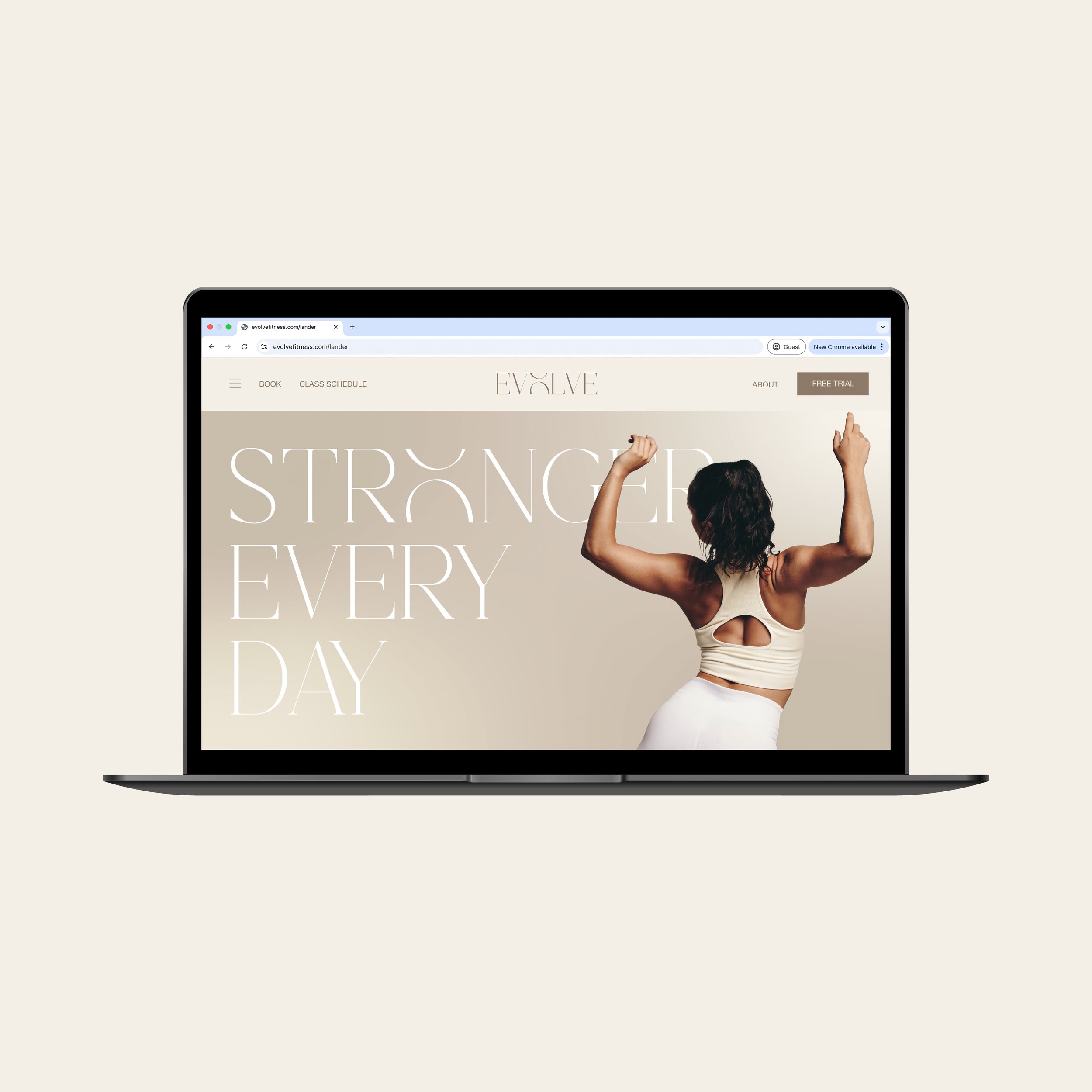
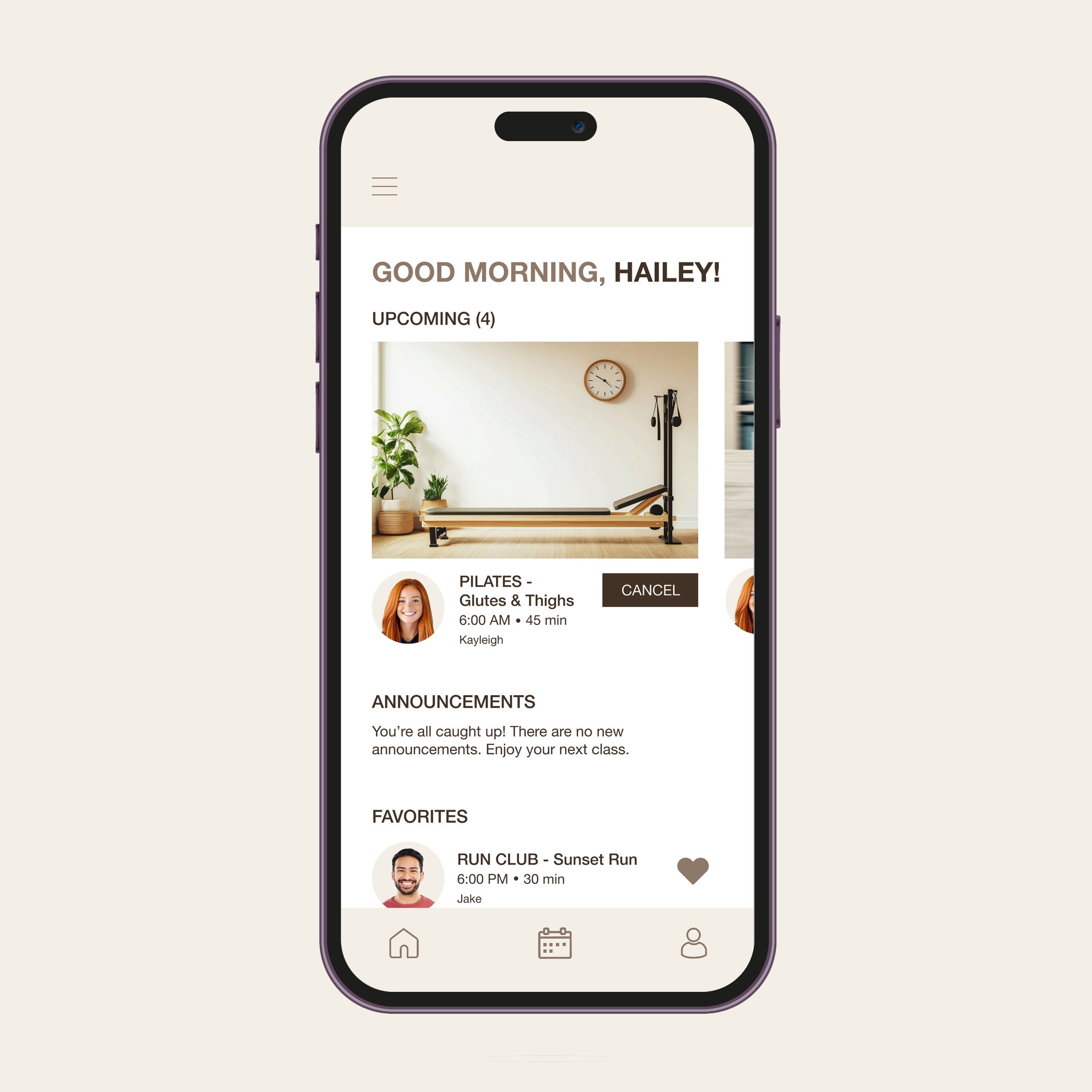
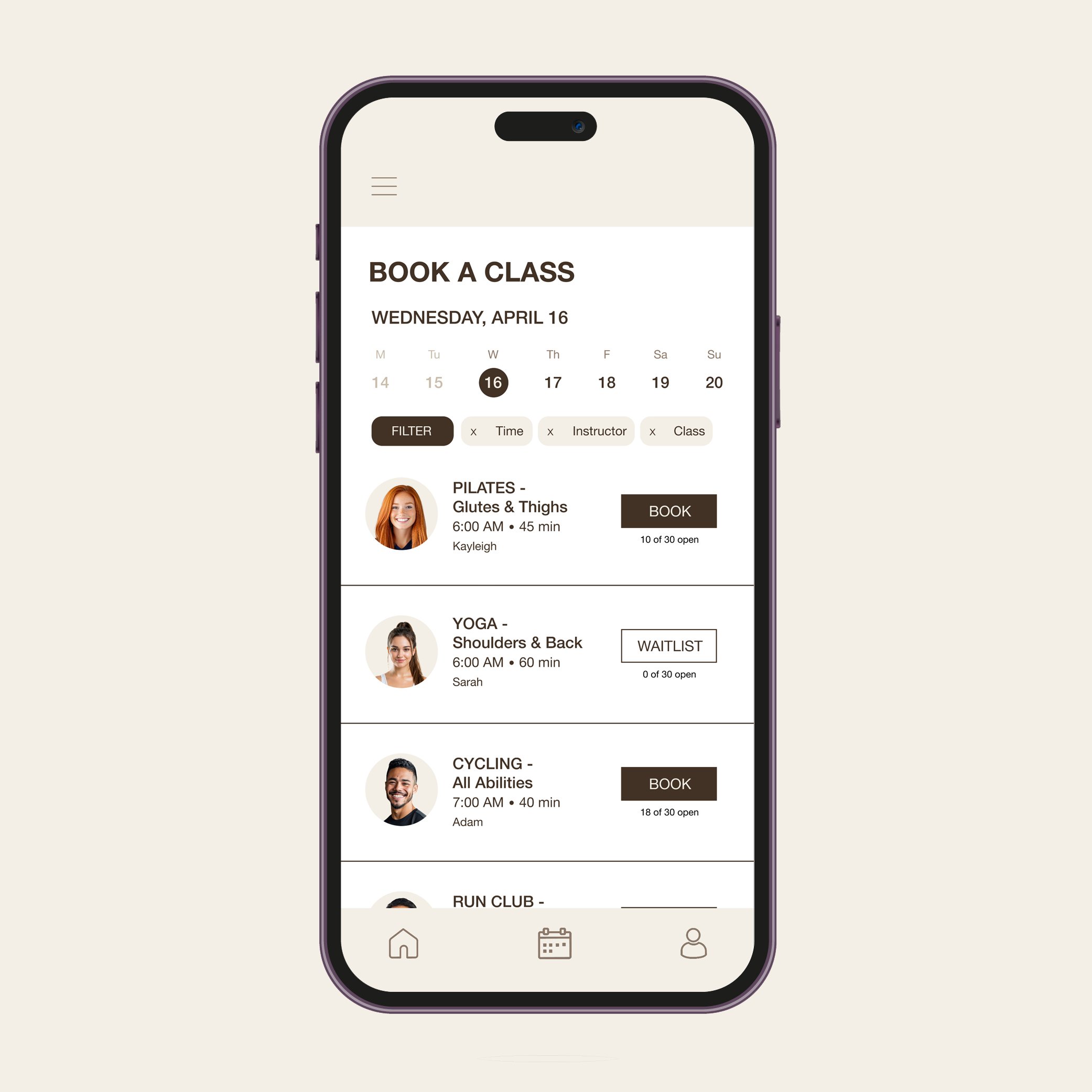
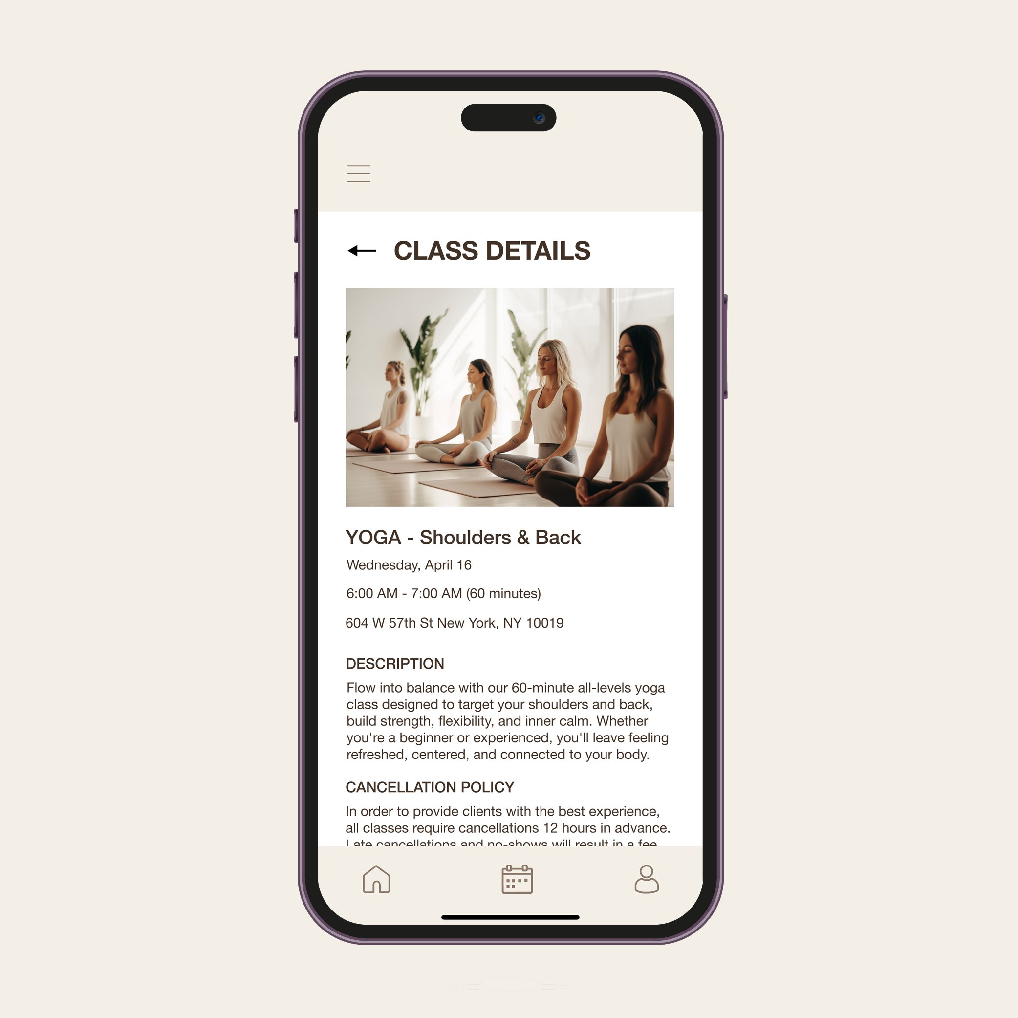
Though I’d designed an Instagram profile with posts, one of the biggest parts of going to a fitness studio is booking classes, so a website and app were also necessary. I used Figma to design a landing page for the website and a series of screens for an app. On the landing page, prospective clients can learn more about the class offerings, view schedules, and book a free trial class. There is also an option for current clients to book classes, however the app should be their go-to resource. The app allows clients to view upcoming classes, announcements, and their favorited classes on the home screen. They can reach the booking screen by clicking the calendar on the navigation bar. Here, you can select a date and see all of the classes scheduled for that day in chronological order by start time and are able to filter classes by specific preferences such as time or class type. To learn more about the class, you can click its name which will reveals the class details. Here you will find some more detailed information and a description about the class, as well as the cancellation policy.