
Type Specimen
OVERVIEW
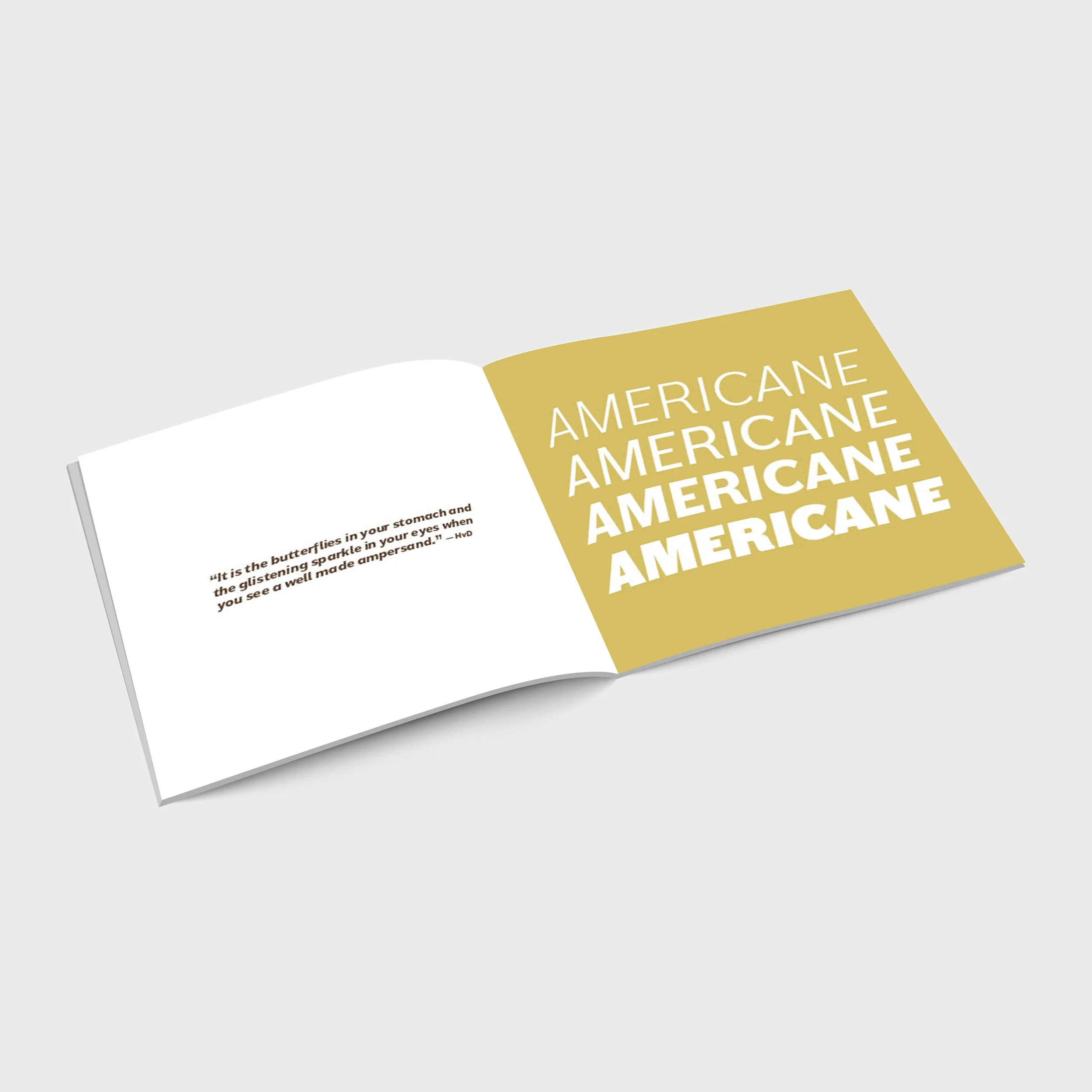
For this project, I was tasked with researching a typeface and designing a unique booklet that explores its history, characteristics, and visual personality. I chose Americane because of its versatility across multiple weights and the way its personality evolves throughout the family.
At lighter and regular weights, Americane presents itself as a clean, approachable sans serif typeface. As the weights become heavier, however, its distinct character begins to emerge, particularly in Americane Black, which carries a bold, edgy presence while maintaining a refined quality that feels less corporate than many other heavy sans serif typefaces.
I wanted the booklet design to showcase this transformation by highlighting all four available weights and allowing each style to contribute to the overall composition. Throughout the copy-heavy sections, I incorporated a thick line element as a visual device that not only creates structure and hierarchy but also reflects Americane’s strong, confident personality. Through typography, layout, and visual exploration, this project celebrates the balance between simplicity and character that makes Americane unique.
ROLE
Designer, editor
TOOLS
Adobe InDesign


