
World Showcase Social Club
OVERVIEW
Just like my first passion project, for my second, “World Showcase Social Club,” I challenged myself to dedicate 30 minutes of design exploration over 30 consecutive days to develop a new creative skill. While I had experience with illustration, I wanted to push myself outside of my comfort zone by experimenting with organic, hand-drawn, sketch-style artwork—an aesthetic I’ve always admired but had never fully explored.
The project began with the idea of illustrating cocktails, but I personalized the concept by focusing on the iconic drinks found throughout EPCOT’s World Showcase at Walt Disney World Resort. Inspired by the popularity of “Drinking Around the World,” I wanted to create something that felt more specific and collectible so each illustration features a fan-favorite drink from one of EPCOT’s countries, designed as a t-shirt graphic that guests could proudly wear throughout the park.
Beyond the illustrations themselves, each design includes the drink’s name, ingredients, and playful “pixie-dust” details that capture the magic and storytelling behind each location. This project allowed me to combine my love for Disney and design while developing a new artistic style and creating a unique take on theme park-inspired merchandise.
ROLE
Designer, illustrator
TOOLS
Adobe Illustrator, Adobe Photoshop

First Draft
Second Draft

Final Draft
PROCESS
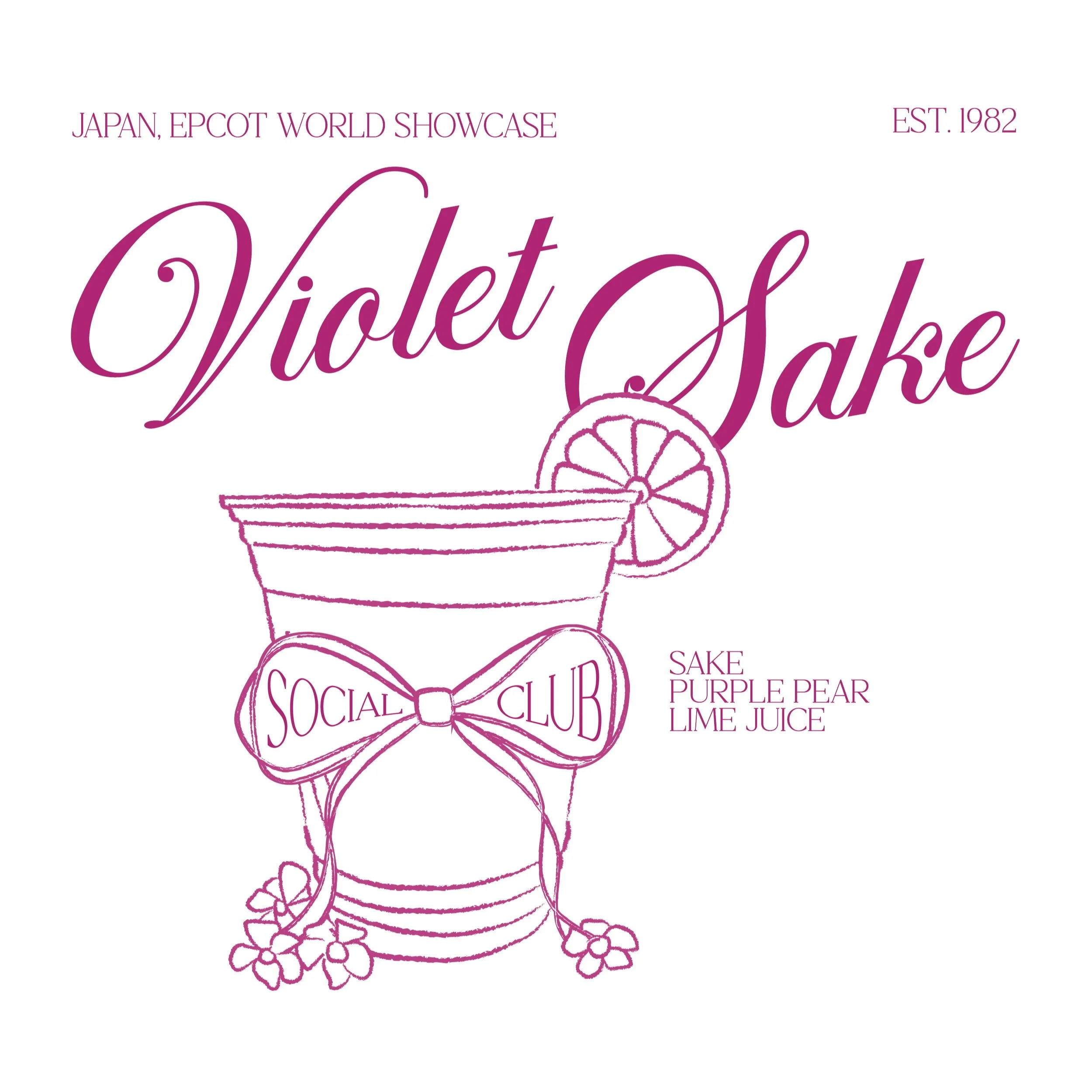
My first step was finding pictures of each drink and using the brush tool in Adobe Illustrator to trace the shape of the cup. The brush stroke that I used mimicked a pencil which is exactly what I was looking for to achieve the sketch-like feel and I wasn’t focused on making the lines perfectly straight or connecting. After that, if applicable, I free-handed a fun garnish or texture and added small embellishments at the bottom of the cups to add some detail.
I thought that the illustrations would be the hardest part for me, but it was actually laying out the information that I wanted to include. When I presented my first draft, most of the critiques I received were that each section felt disconnected from one another. To fix this, I originally tried overlapping the ‘social club’ oval with the cup in some way but didn’t feel that it worked. After looking back at my inspiration, I decided to add some character to the cups by giving each a bow and adding ‘social club’ in between the loops. Making the names bigger and overlapping with the cups also helped establish more of a connection between the sections. After some consideration, I ended up removing the ‘social club’ from the back completely to simplify the design, leaving it for only the front, and filling in the bow to add some dimension.
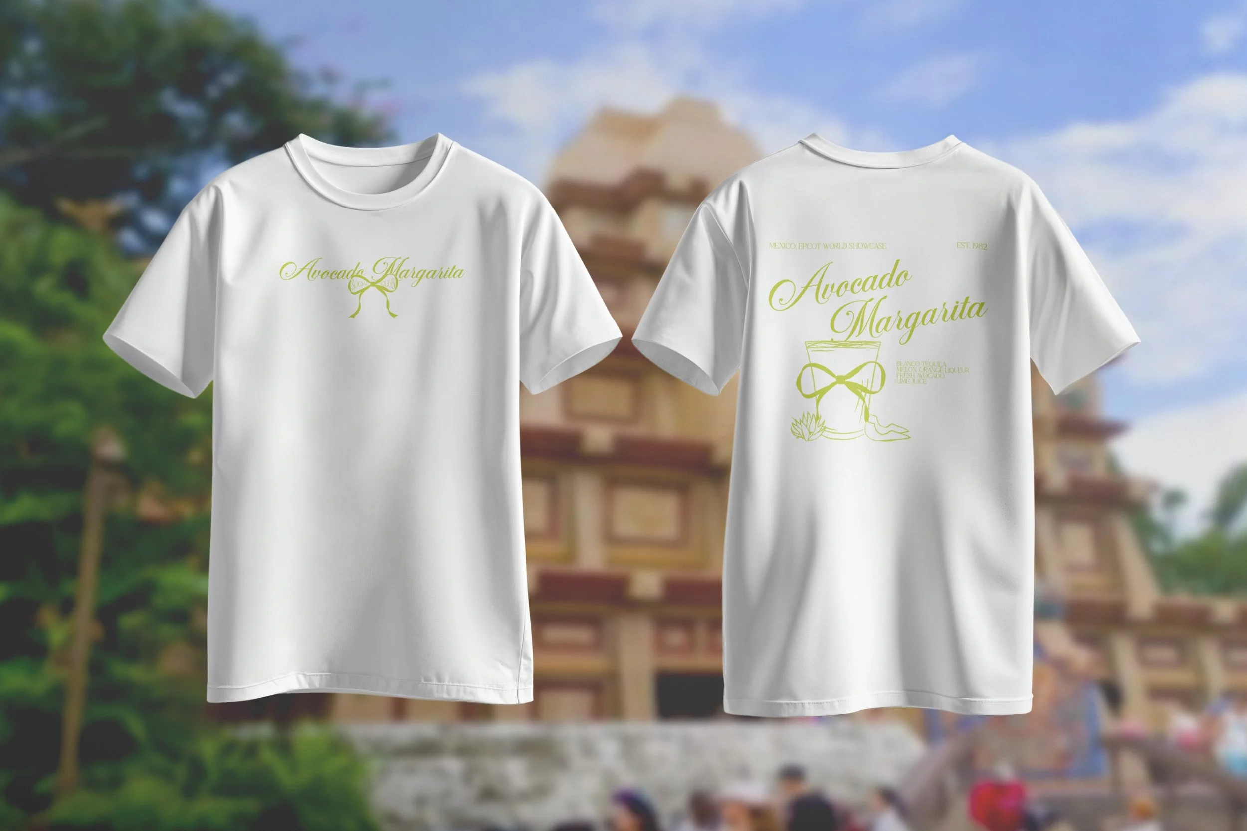
Mexico, Avocado Margarita

Norway, Viking Coffee
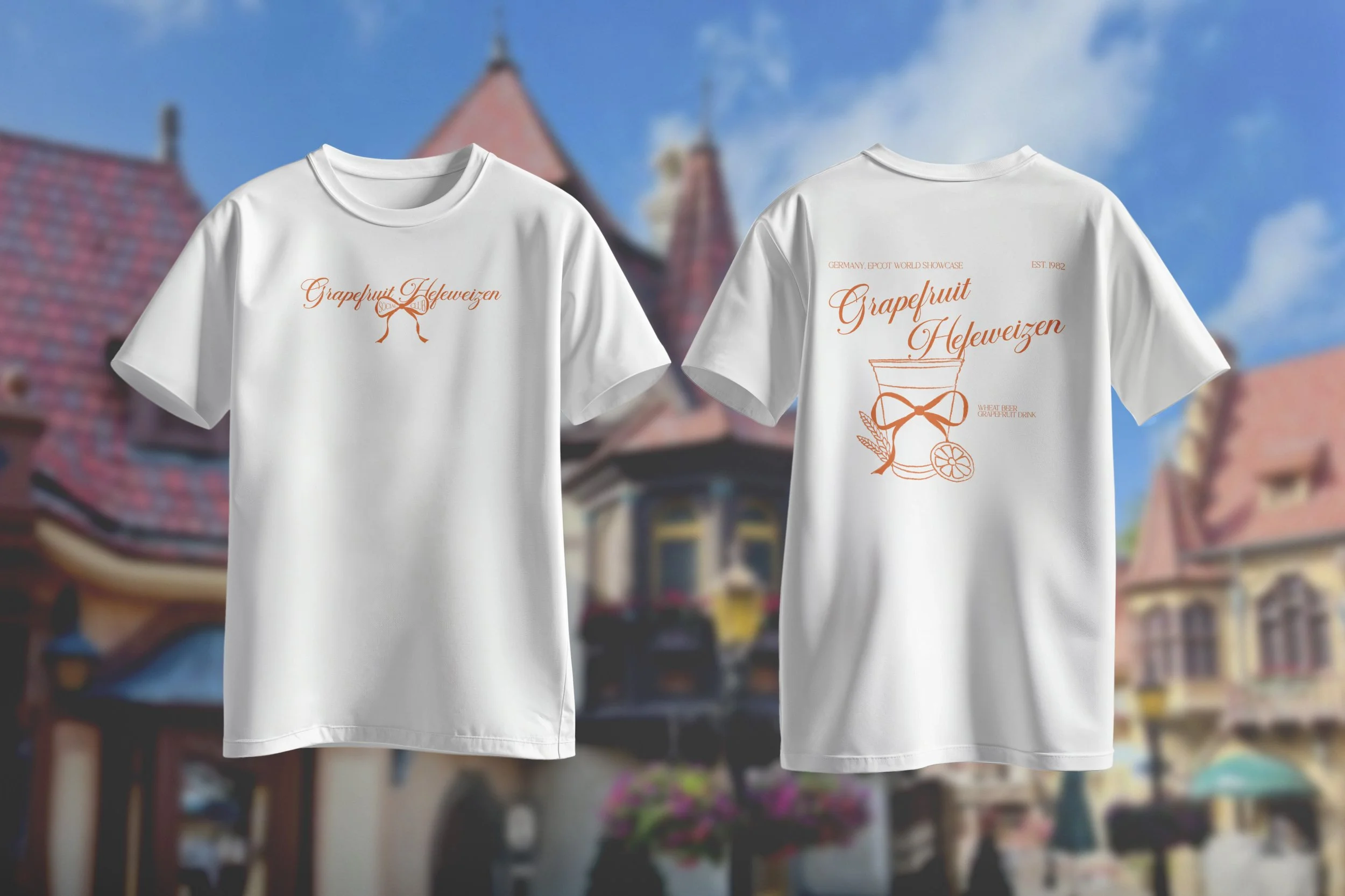
Germany, Schöfferhofer Grapefruit Hefeweizen

American Adventure, Moonshine Sour
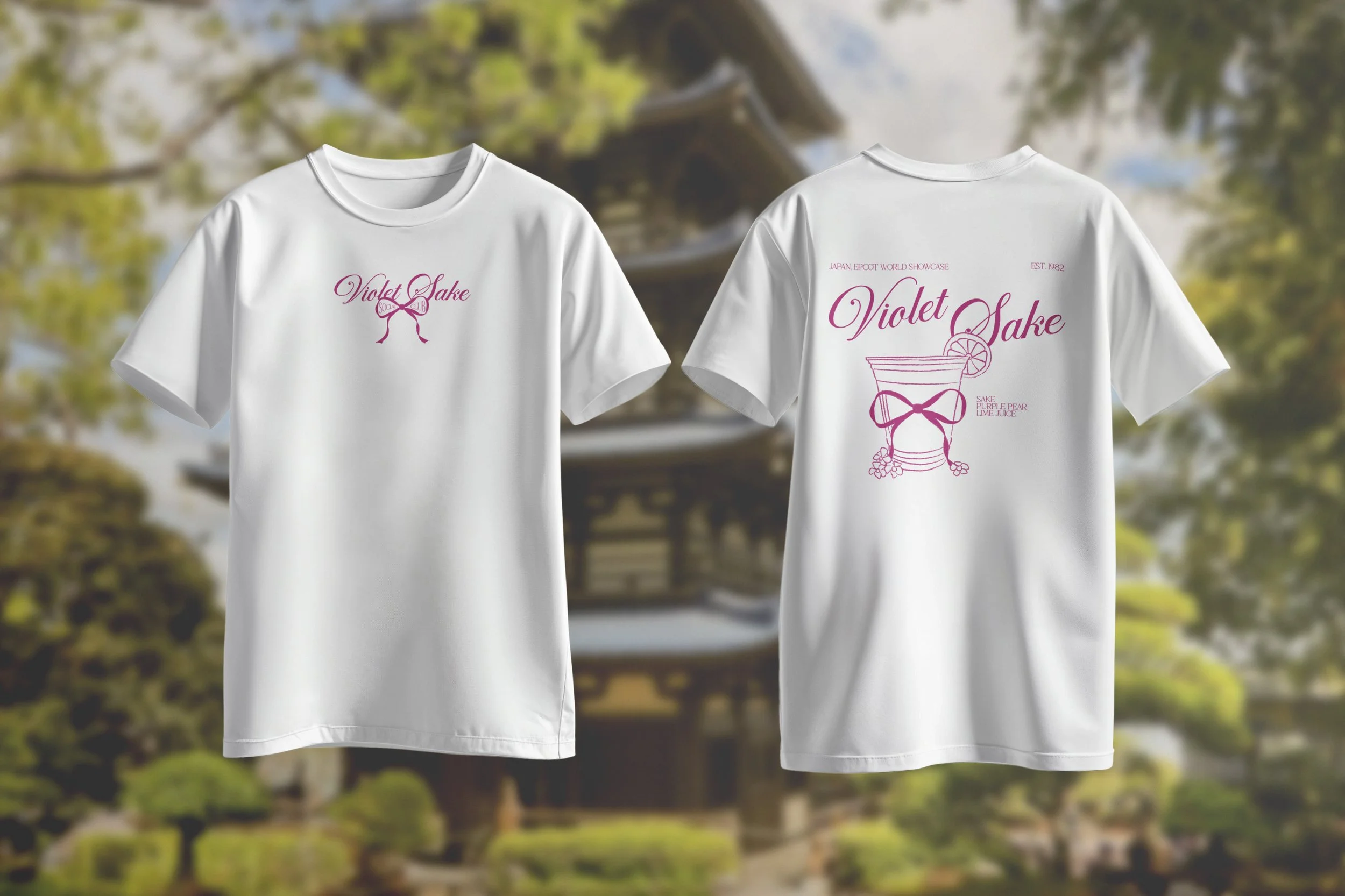
Japan, Violet Sake

Morocco, Red Sangria

Morocco, White Sangria
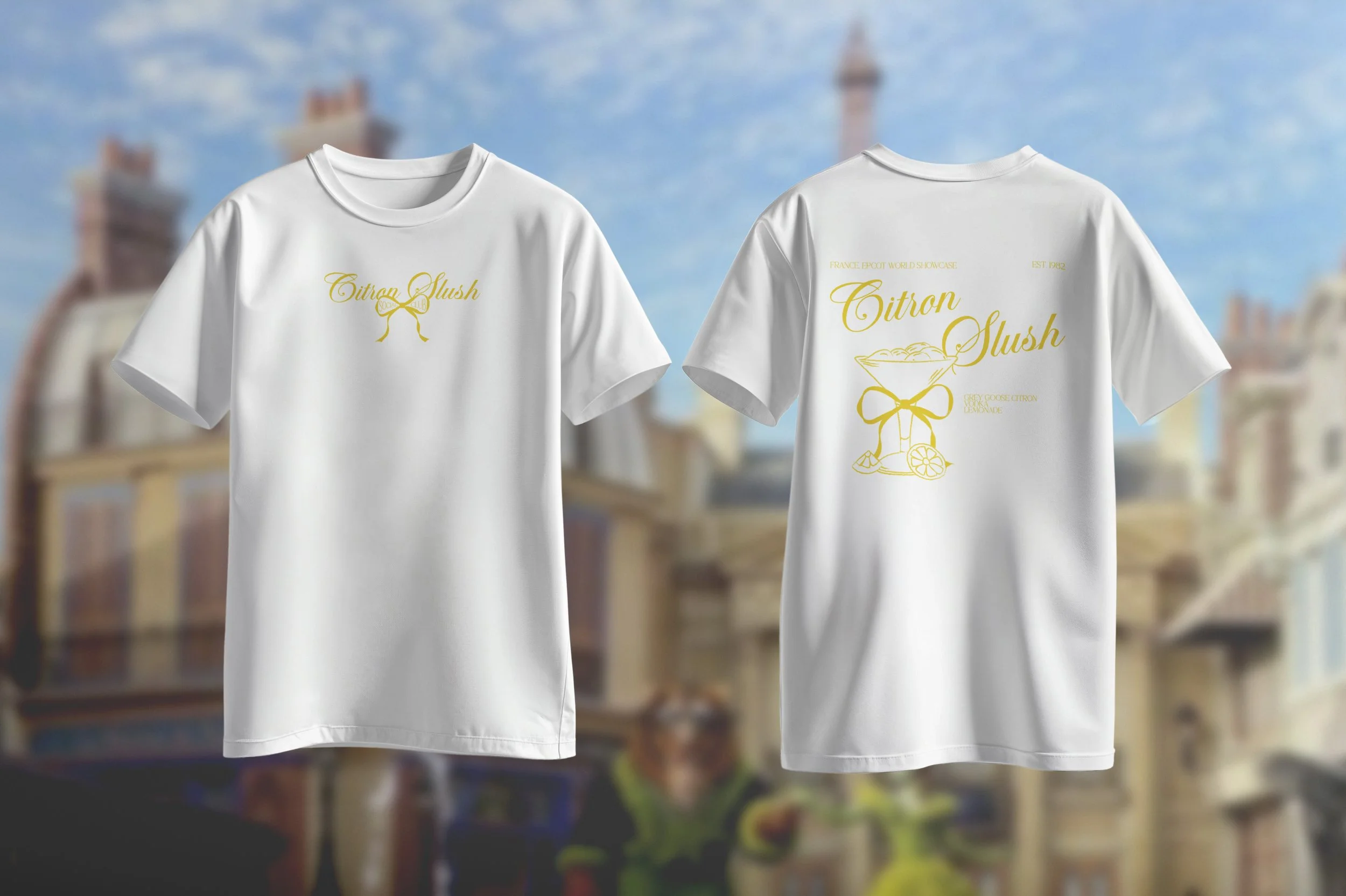
France, Citron Slush

France, Orange Slush
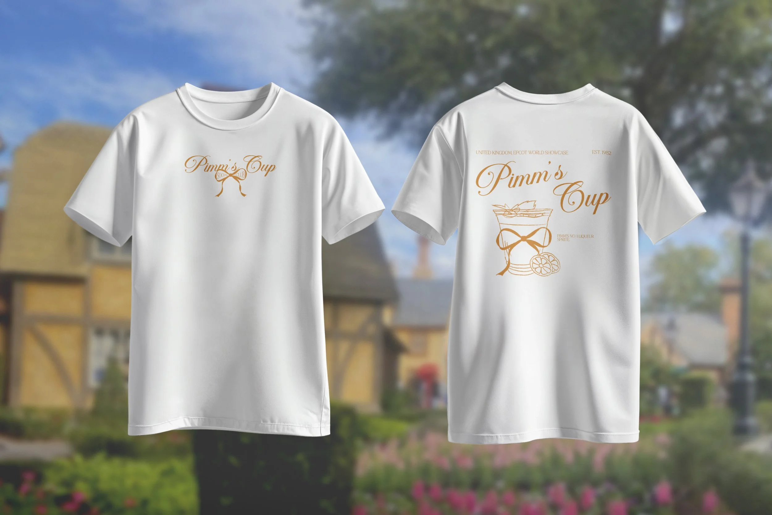
United Kingdom, Pimm's Cup

Canada, Ottawa Apple